Vassilissa
Semouchkina
Designer
Saint Petersburg, RF ︎︎︎ State College, PA ︎︎︎ Ann Arbor, MI ︎︎︎ Houghton, MI ︎︎︎ Seattle, WA ︎︎︎
Interdisciplinary design practitioner currently working as a field mycologist, professional truffle hunter, and foraging guide for Forage Seattle and the Truffle Dog Company
About
Global Research and Imaging Platform (GRIP)
︎ Brand refinement
Website redesign
Website redesign
Tags: UX/UI, Information Design, Scientific Communication, Brand Design, Content Strategy, Design for Health, Account Management
About
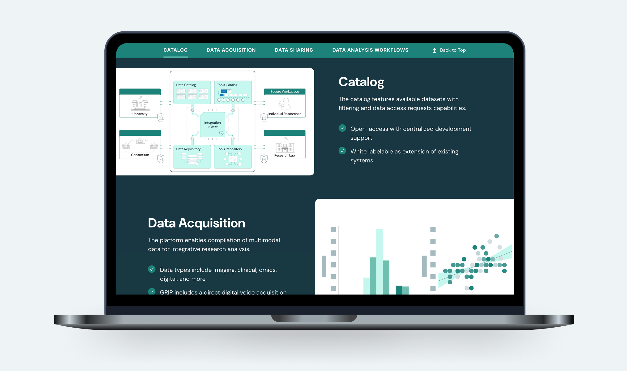
The Global Research and Imaging Platform (GRIP) is an integrated suite of tools designed to empower researchers and scientists in biomedical discovery, data sharing, and analysis workflows. GRIP offers a seamless ecosystem and cloud-based environment that streamlines complex, multimodal processes, eliminating the need to navigate multiple platforms.
Contributions + Role
While I did not work on the initial design of the GRIP platform, I was the sole and lead designer of the redesign effort. Phase 2 was leveraged to address several key goals:
- Improved visual balance across the site and corresponding elements
- Website restructure grounded in content strategy-based approach, including removal of redundant content while maintaining the ‘essence’ and key features of the original site
- Creation of refined information visualizations to support more robust communication of the GRIP ecosystem
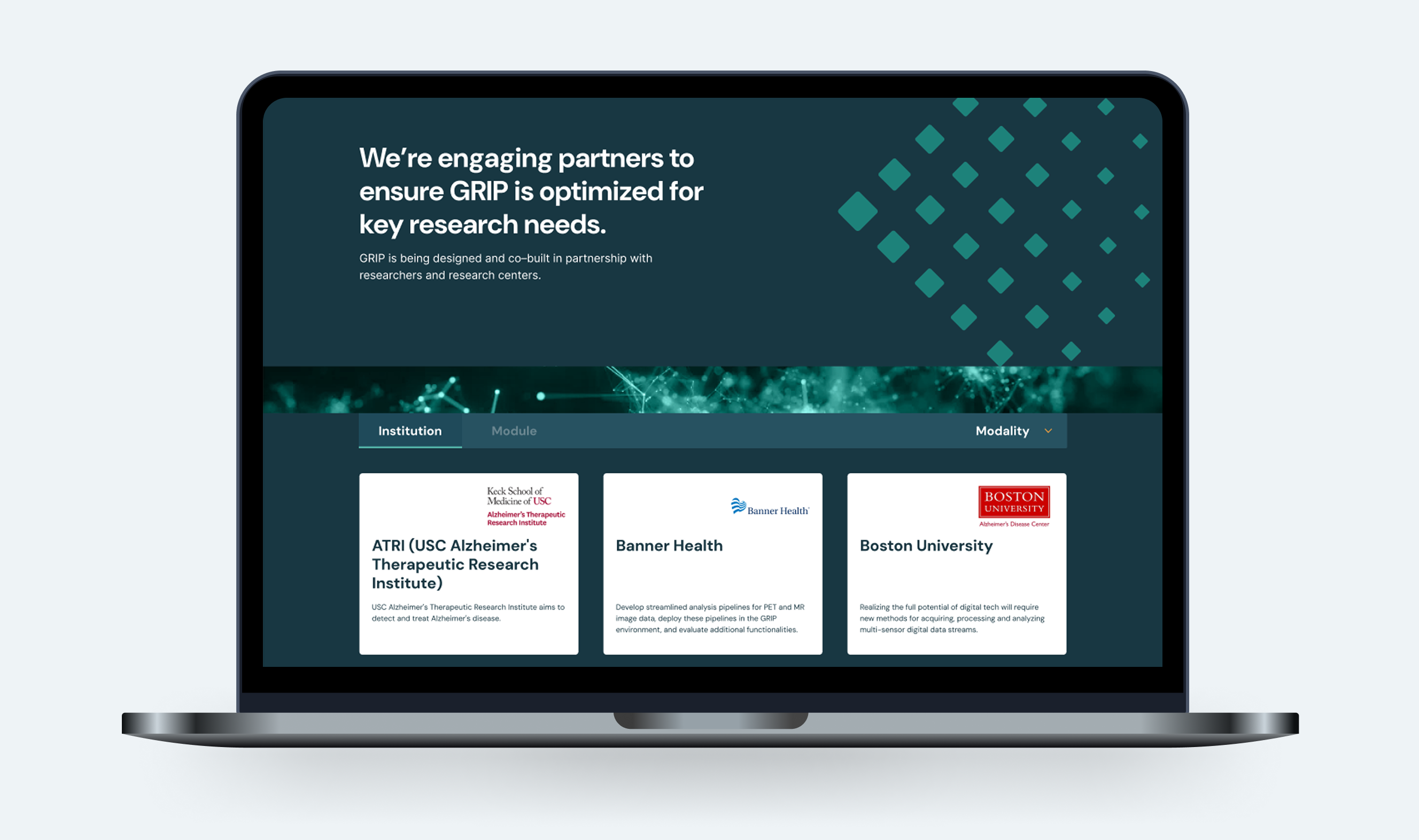
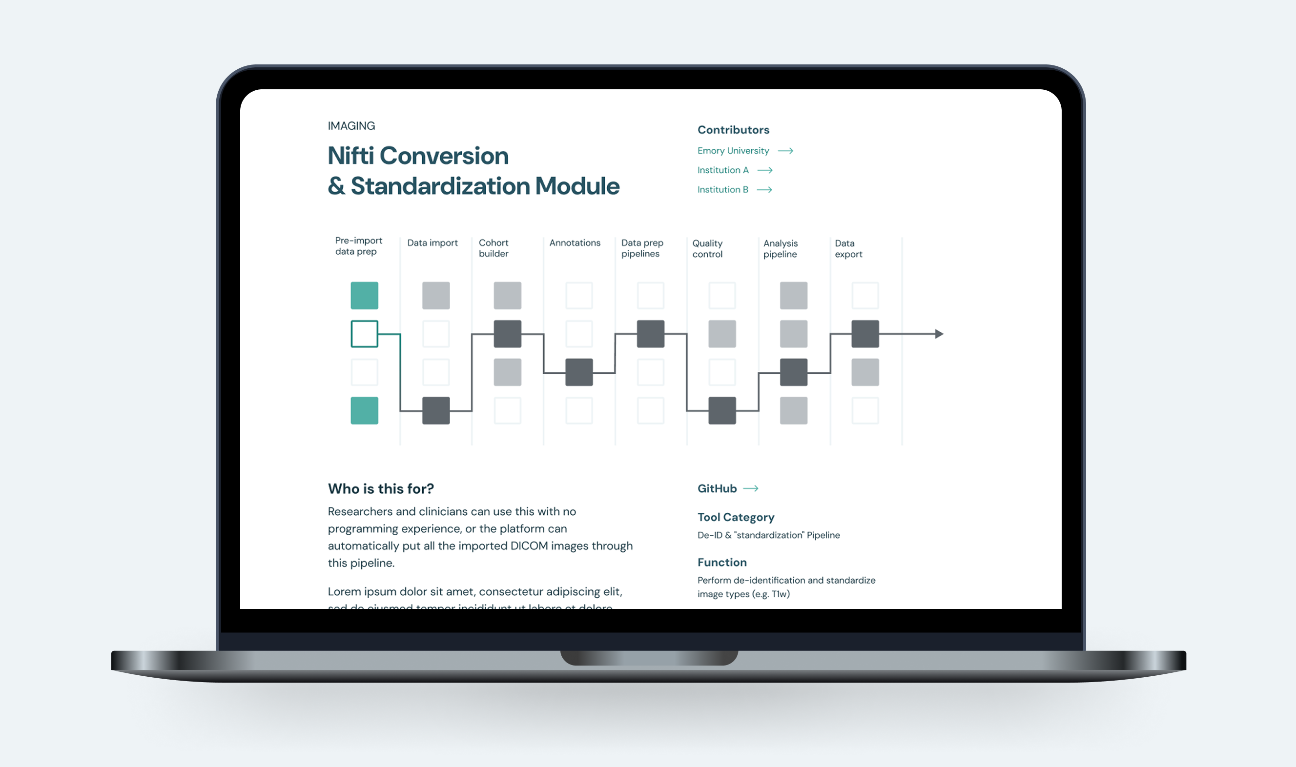
- A more in-depth ‘Our Partners’ section, with individualized baseball cards for research partners and modules leading to dedicated pages for each
To address the above goals, my responsibilities included the following:
- Executing research-grounded user experience and interface design
- Creating and ensuring accuracy of bespoke information visualizations
- Aligning brand design with platform strategy, as well as brand guide creation
- Content strategy scope, plan, and guidance, including biweekly client presentations to update on effort progress
- Early and continuous communication with and involvement of development team in design process, including provision of detailed dev notes
- Ongoing CMS support and management, in conjunction with the development team.
Completed
February 2025
Software
Figma
Adobe Suite
KontentAI (CMS)
See More
GRIP Platform
Global Research and Imaging Platform (GRIP) The GRIP website and platform redesign, also known as ‘Phase 2’ to the client, was a 3-month effort spanning from discovery to development. Minding the timeline and the client’s goals, this effort spanned across a series of sprints with weekly virtual checkpoints and biweekly presentations. This approach gave the client clear visibility into project progress, as well as ensured that all stakeholders has adequate time to react to proposals and provide feedback. In addition, the development team was brought on to the project during the wireframing stage to support mutual understanding of the planned changes to the website and to provide them with adequate time to prepare.
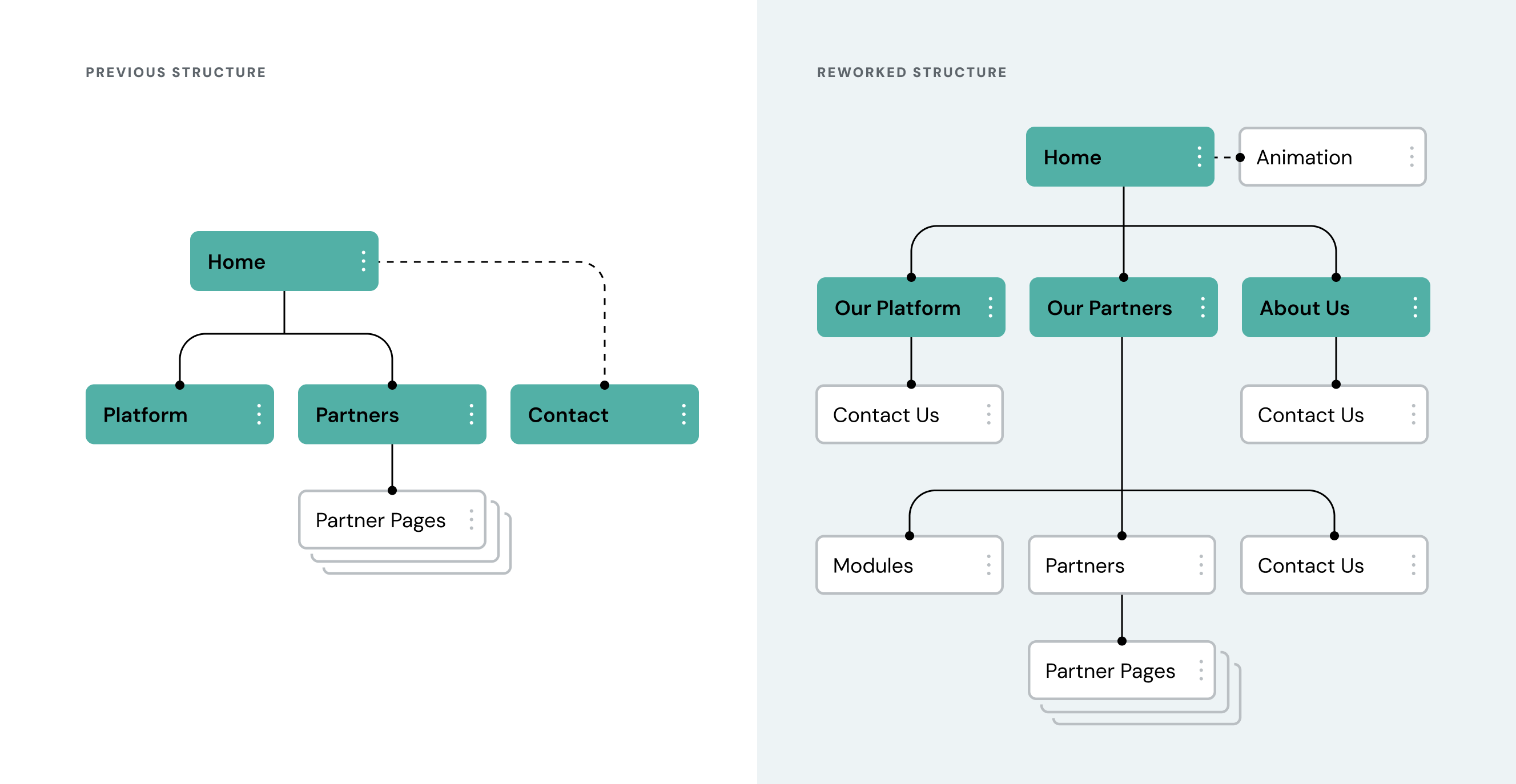
Content Architecture
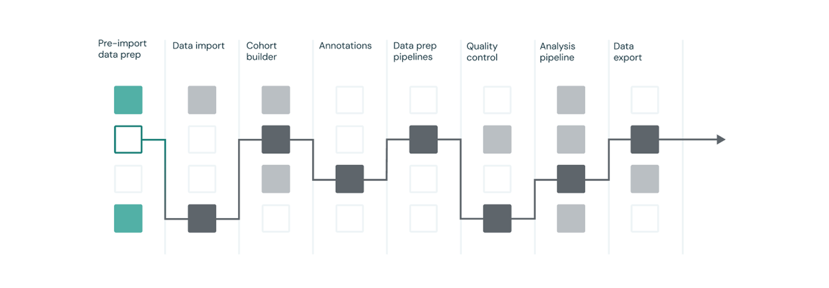
One of the major goals of the redesign effort was to build up the website to more clearly and deeply showcase the value of the GRIP platform to researchers and scientists. Considering this, one of the first major hurdles to overcome in the design process was building upon and restructuring the existing content. This was done in collaboration with the client to ensure that the website’s content hierarchy and thematic intent was optimized to meet the client’s goals.
Rebuilt/New Webpages + Features
Once the content strategy was agreed upon and finalized, it served as a blueprint for creating the new skeleton of the GRIP platform. The updated website includes rebuilt and newly added pages and features:
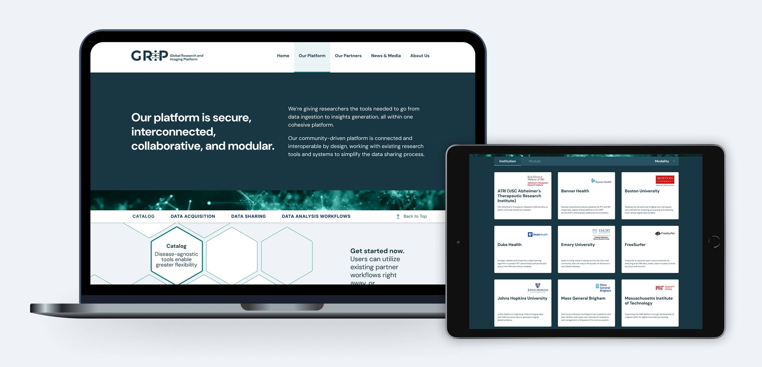
- Interactive ‘Our Partners’ page with redesigned architecture allowing baseball card-style sorting of partners and tools (modules), as well as inclusion of custom partner and module pages
- Refined ‘Our Platform’ page with GRIP ecosystem GIF and key feature highlights
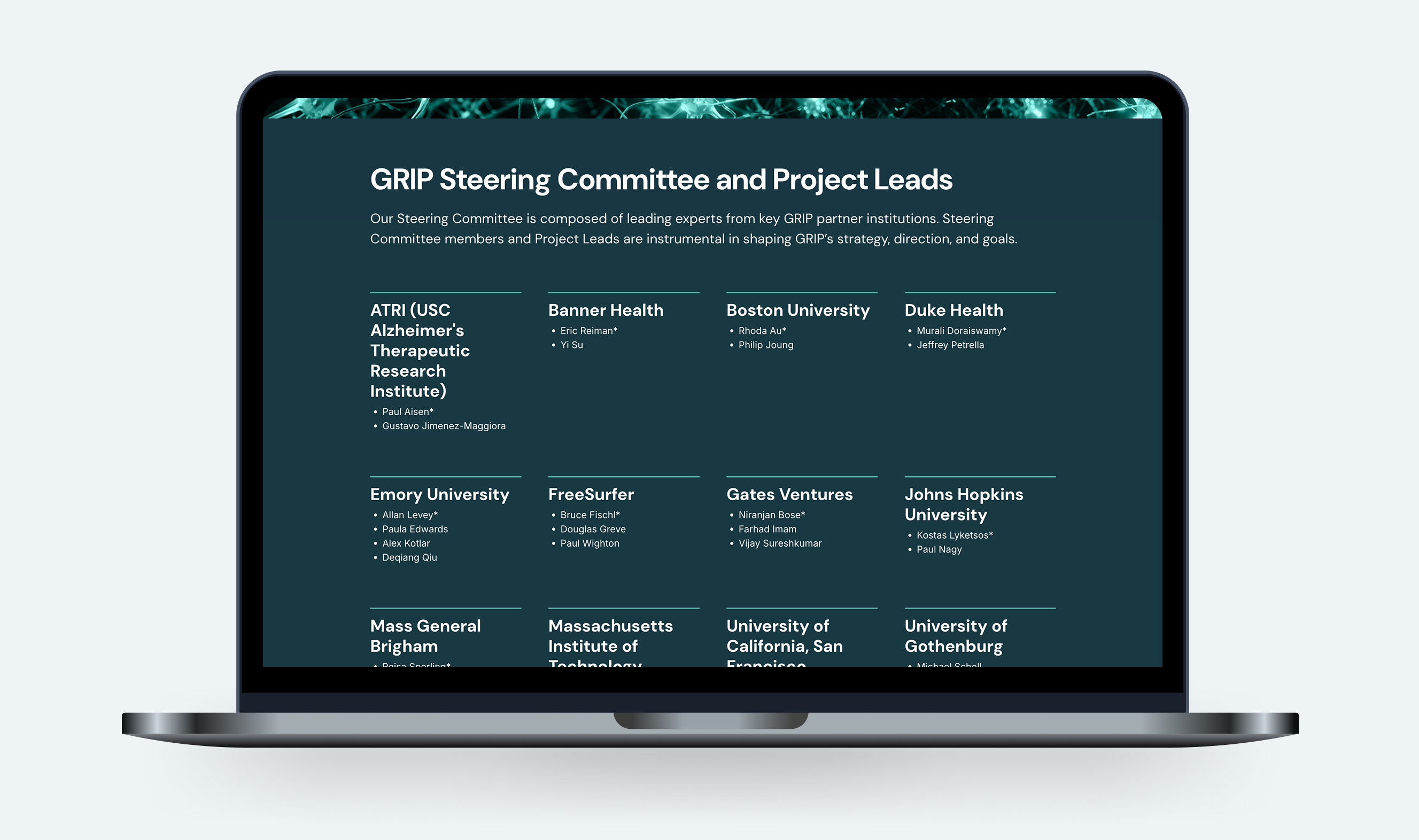
- New ‘About Us’ page with additional background on the GRIP team, partners, and steering committee
- Recurring footer featuring a prominent ‘Contact Us’ CTA and social media links
- Custom synopsis animation embedded at the bottom of the homepage
To support a more granular data narrative, an animated video was created to pair with the content on the platform homepage. View this animation at the bottom of the GRIP homepage:
GRIP Animation [Link]
Brand Refinement + Information Visualizations
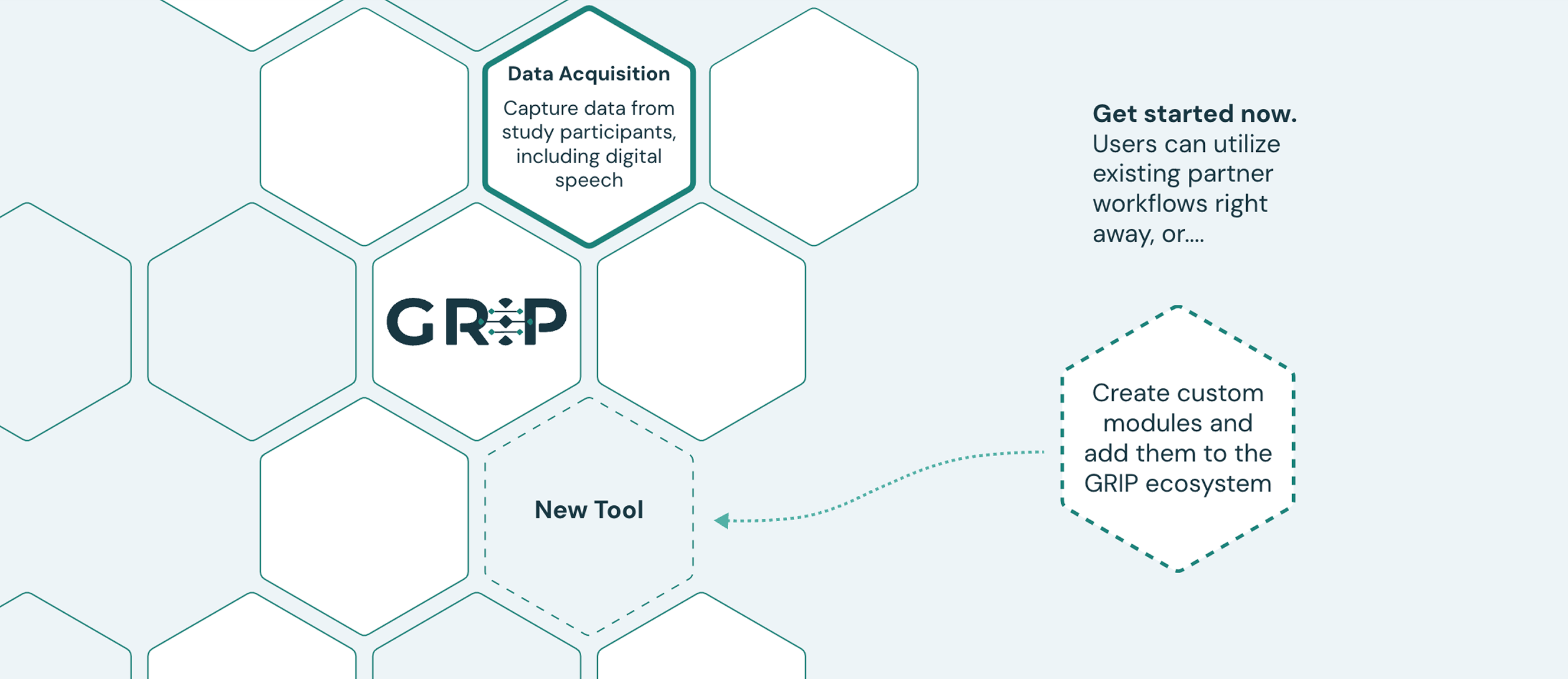
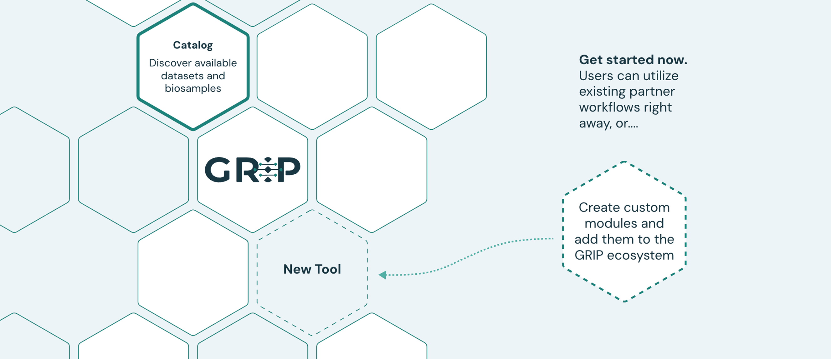
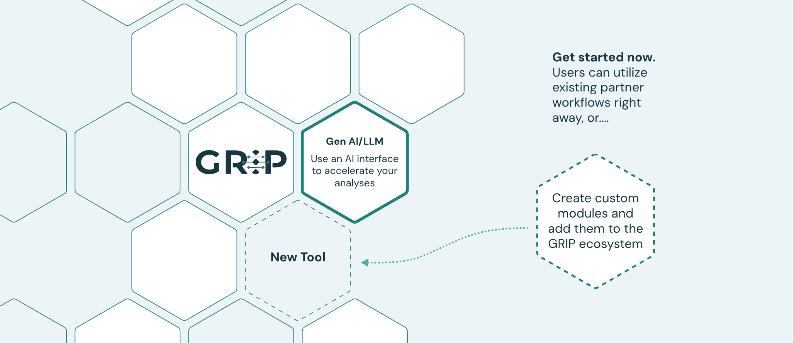
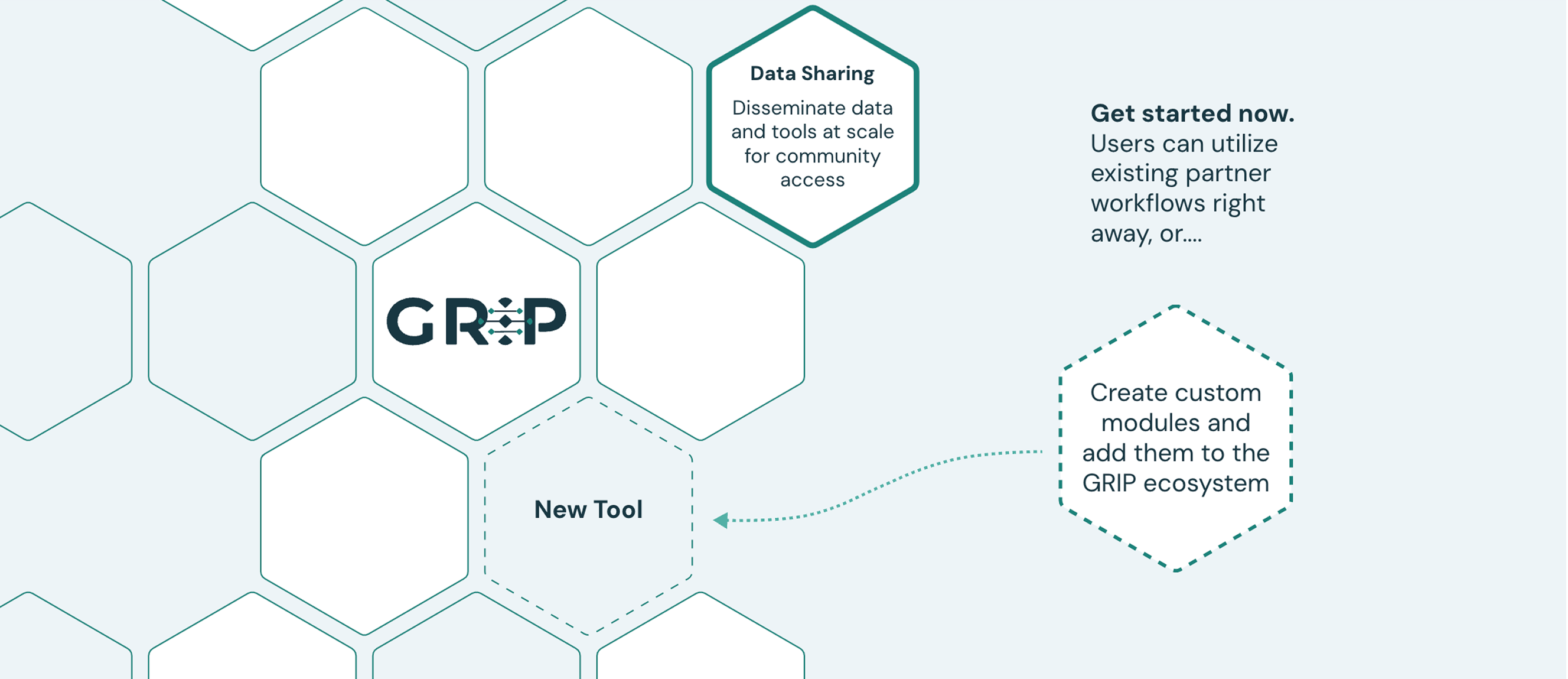
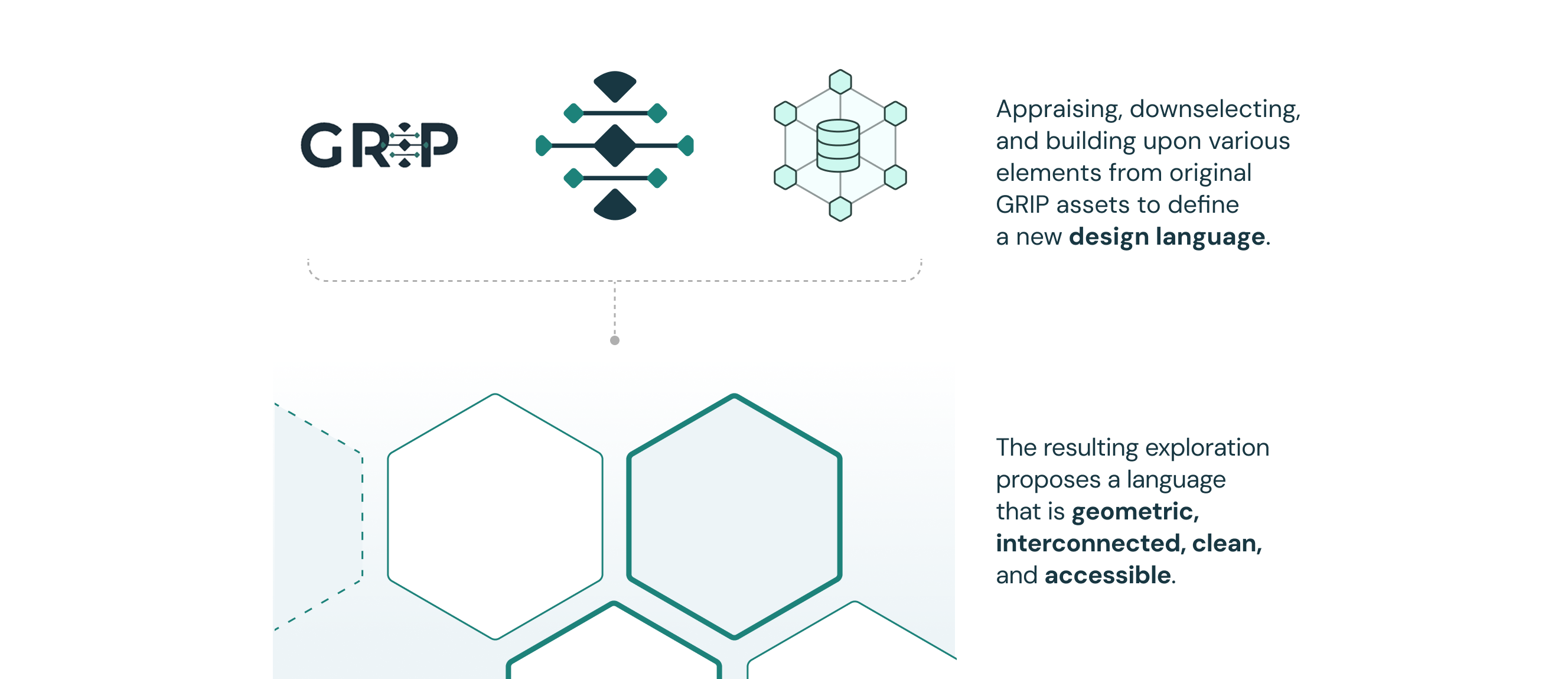
The GRIP brand update centered around creating a cohesive, consistent, and scalable design language. The refined brand guidelines reflect GRIP’s clean, geometric, and minimal identity. Information visualizations and other brand refinements were introduced to support platform content. Elements like hexagons and diamonds, used throughout GRIP’s visual assets, are influenced by the brand’s logo and the GRIP animation.
*
Highlight: Design System CreationWhile the GRIP team needed a functional and dynamic solution in the short-term, it was clear that the platform endeavored to grow and reach crucial new stakeholders. It was therefore critical to create tools and pre-built assets so the GRIP team might quickly update their platform materials when needed. In addition, this would ensure that our designers would be well-equipped to support any expedited design requests in the future.
When it comes to medical start-ups, delivering assets with a quick turnaround time is often the rule, rather than the exception. Considering this, it was essential to create and begin maintenance of design and content guidelines in the early stages of a design process. These guidelines needed to remain malleable to change as the design language matured and a clearer picture of the future and/or final stages of a project/product materialized. Establishing and maintaining design guidelines early had the added benefit of:
- Enabling heightened understanding and alignment between team members
- Establishing a baseline for making design decisions
- Creating an effective tool for communicating with the client
- Acting as barometer to detect inconsistencies and anomalys in the design language
Brand Language
When initially developing the design and content guidelines, we first audited a selected set of materials and assets the GRIP team requested we retain and use as starting points. These materials included the GRIP logo, an introductory animation that other designers and I had worked on earlier in the year, as well as a few pages of mixed content. These assets were evaluated, broken down, and categorized to create flexible, buildable brand guidelines.
The GRIP platform is expansive, interconnected, and collaborative, and the brand language needed to reflect this:
- Design elements must be geometric and modular
- Hexagons and diamonds are the primary secondary elements
- Component-based secondary elements represent the platform ecosystem
- Rounded corners soften and humanize the UI
- Connecting lines emphasize relationships
- Use of attention-grabbing visuals, like icons and/or infographics, should be limited and leveraged primarily to deconstruct visual or informational complexity
- The color palette must not be distracting and should be used intentionally
- The font system must be clean, minimal, and leveraged in service of content and content strategy
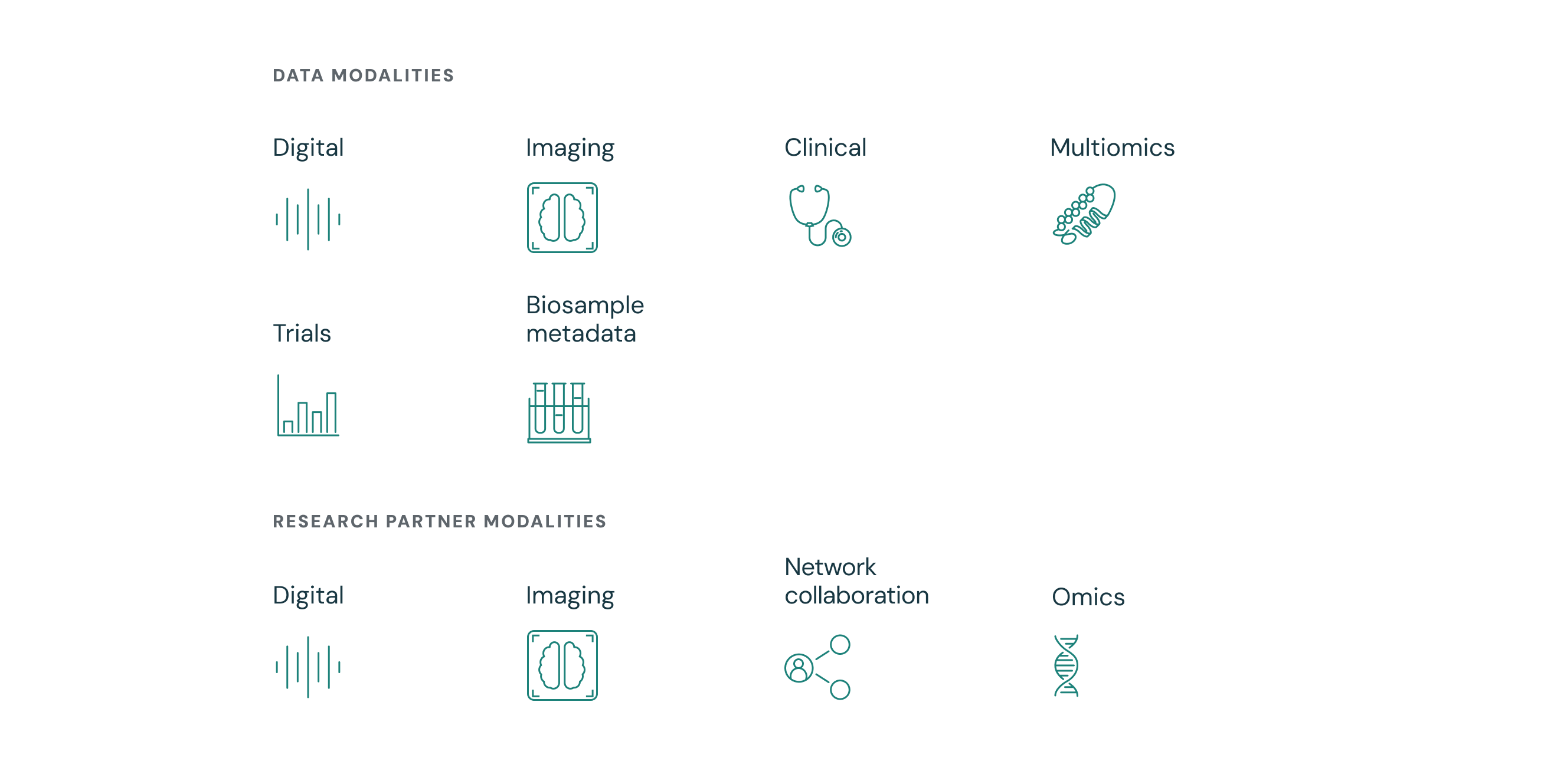
Icons
Icons were created to represent modalities and support categorization of research partner groups. While it was essential that the icons follow the overall brand language, there were additional design considerations:
- Use of white space and gaps between connecting lines to support icon legibility at varying scales
- Use of clean and easy to understand pictoral representations
- Avoidance of metaphorical representation where possible to mitigate for stakeholder confusion (varied nationalities, educational backgrounds, etc)
Color Balance
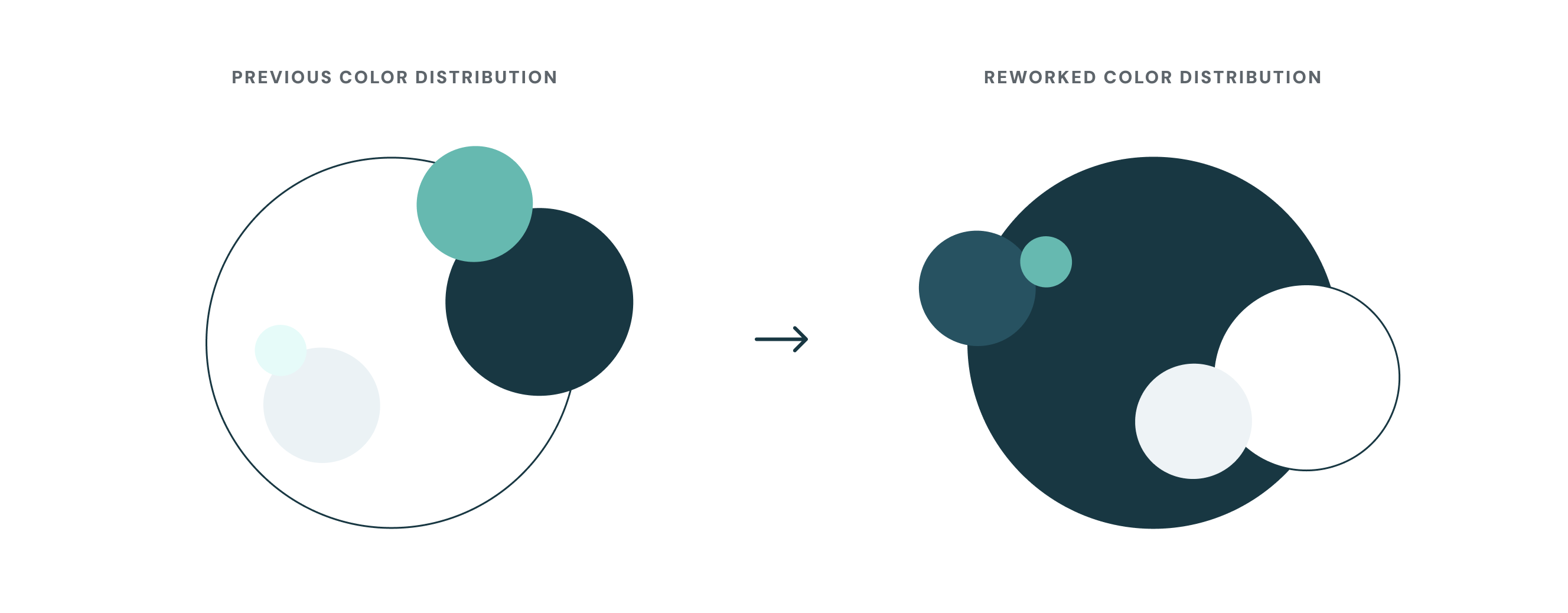
Key brand updates included typography, typographic hierarchy, shape forms, corner radii, color usage, and grid ratios. A major change was the website's color scheme, shifting from a predominantly white design with multiple spot colors to a more balanced, darker palette. This shift allowed for more intentional use of color across the site, balanced contrasting colors, and limited use of bright spot colors.
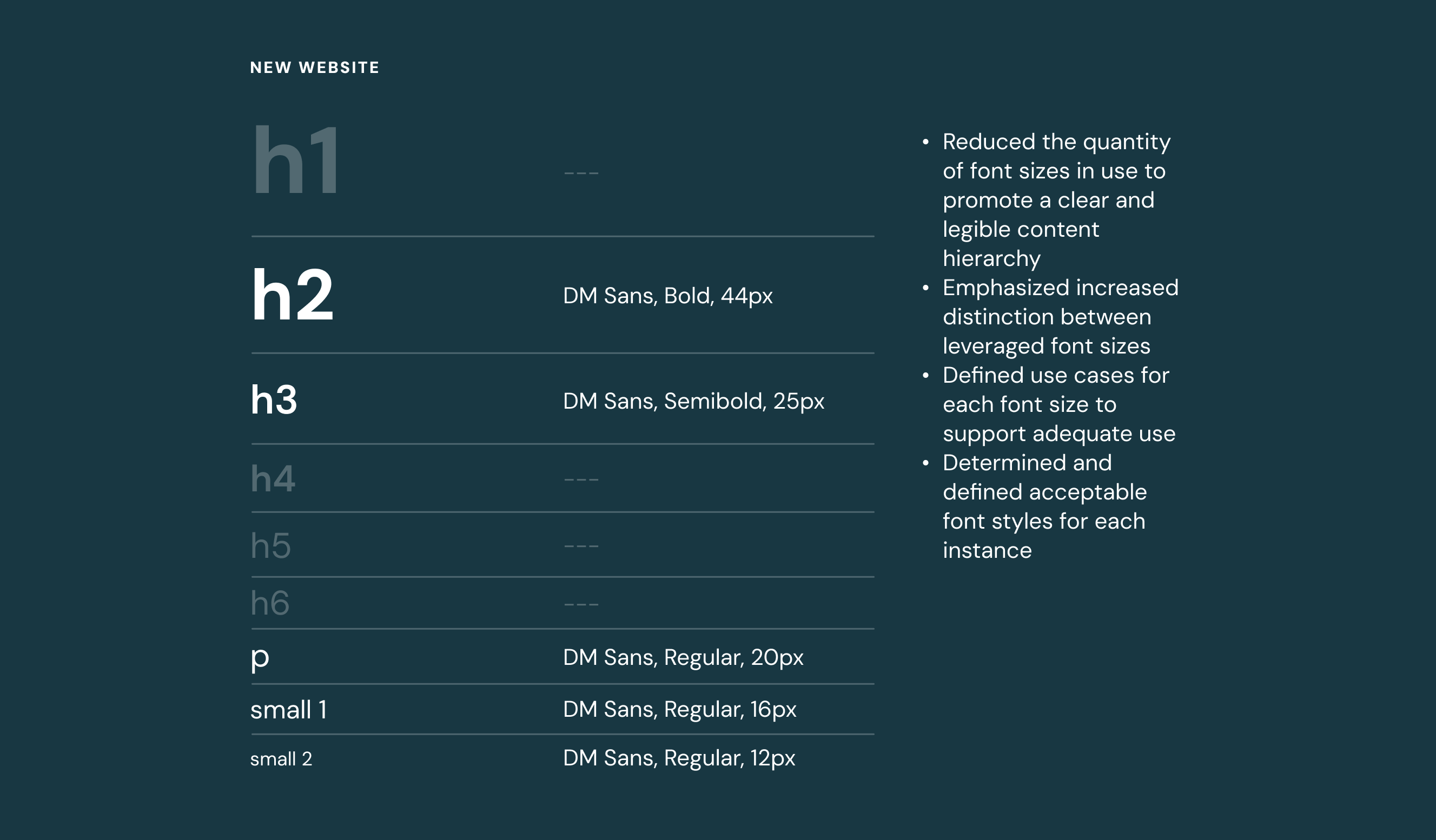
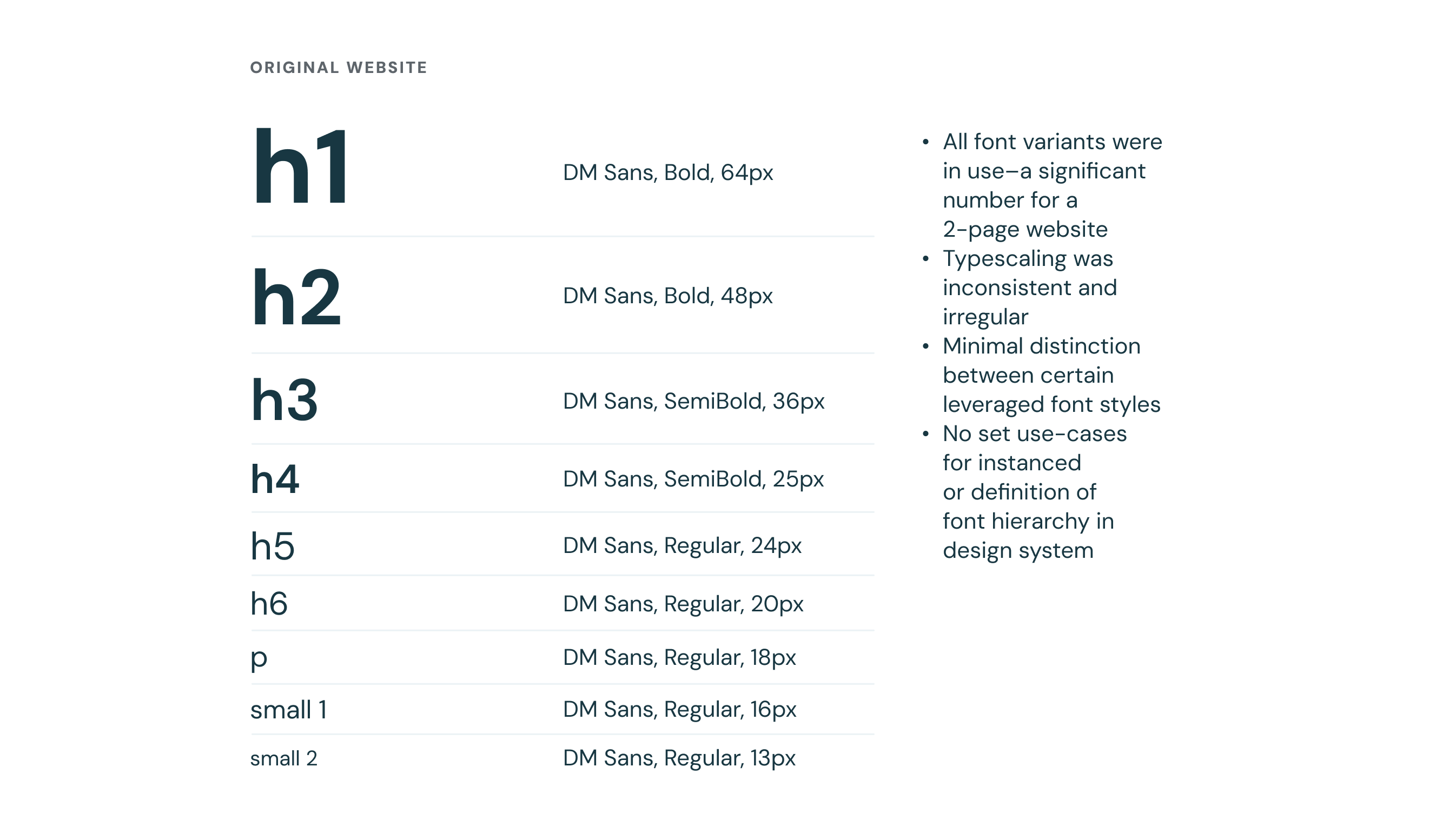
Font System
The original GRIP website, though consisting of two short pages, leveraged a considerable quantity of font styles. After an audit of existing fonts in use across the site, fonts were typescaled and sizes were adjusted. A reduced quantity of fonts was recommended for use, with guidelines created to define font styles and use cases for each. This supported a more legible and distinct type hierarchy, and reduced visual noise in an already complex informational ecosystem.